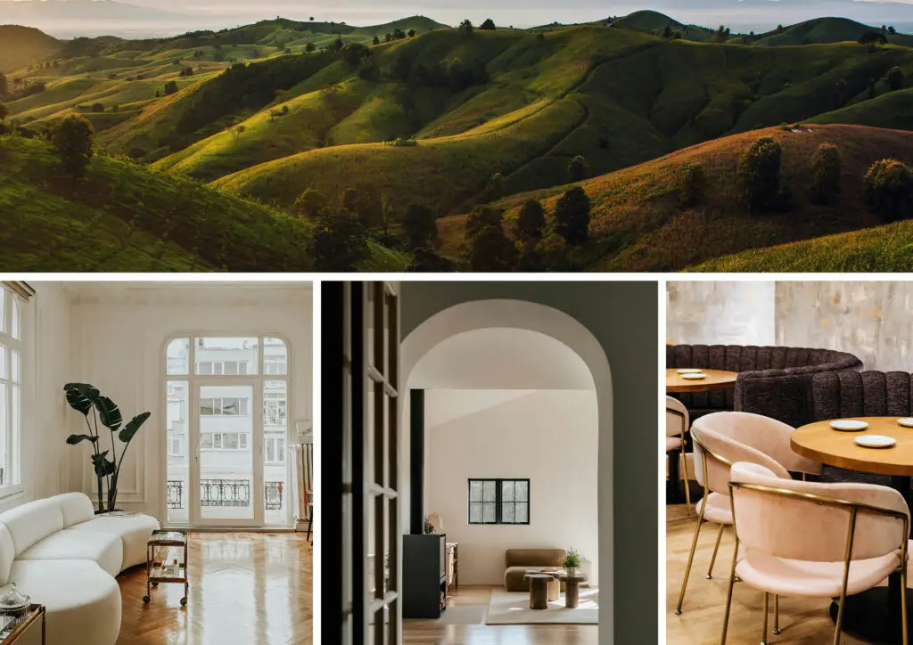
The elements and principles of design are the tools designers and artists use to create their work. Good Design is a collage of these concepts, coming together to create something pleasing to look at and enjoyable to use. Knowing the elements and principles of design pulls back the curtain for how designers can create something from nothing.
The elements are the physical components of a design (such as lines, shapes, textures, etc.) and are the building blocks that make up the whole. The principles refer to the way elements are arranged within a design and how they interact with one another (often using the space between elements just as much as the elements themselves).
The various relationships of the principles are what bring the design to life. While they might not be the most obvious, they carry the most weight, evoke the most feeling, and create the biggest impact on the viewer. The principles can’t be created without the elements, and the elements can’t come to life without the principles. They play a vital role in making a Good Design, and this article is a basic introduction to them.
- Principles (How The Building Blocks Interact)
Elements (The Building Blocks):
Line
In its simplest definition, a line connects two endpoints, but when applied to a design, it creates a feeling of movement, drawing the viewer’s eye around an artwork, product, or interior. Different types of lines produce various effects on how a design is perceived, both in art and reality.
Images sourced from Unsplash/Pexels, combined in Indesign
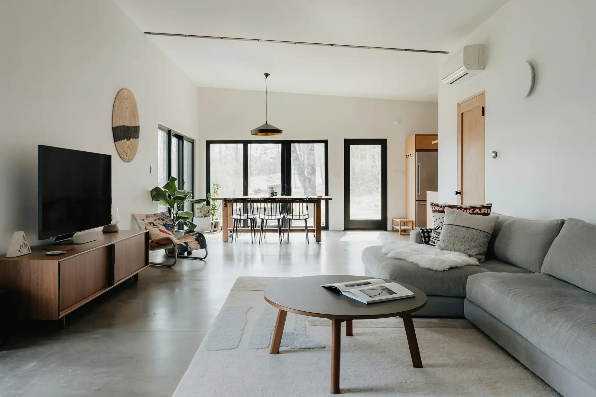
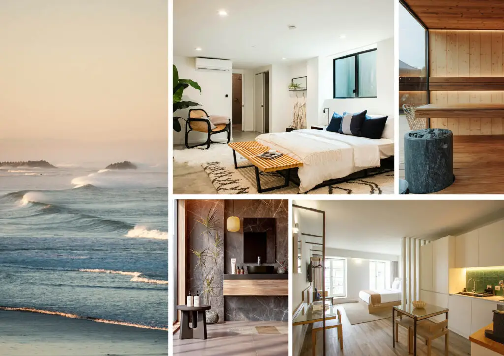
Horizontal lines are processed in the brain as if they were horizon lines (the point where the sky appears to meet the earth or sea), evoking a feeling of stability and groundedness. When applied to an interior, horizontal lines can make a room feel wider, stable, and balanced. This line type is peaceful to look at; however, a space containing too many horizontal lines, at differing heights, can have the opposite effect.
Since there is only one horizon line in nature at a time, the brain tends to prefer one continuous line. This can be achieved by using horizontal design elements in a room (such as the horizontal window in the image above) or a creating a perceived line through objects of similar heights being placed next to each other. For example, in the image above, the couch and chairs are similar in height, causing the eye to move horizontally from one side of the room to the other. Additionally, in artwork and product design, these same concepts hold true: uninterrupted, clean, horizontal lines create a calm response in viewers/users.
Images sourced from Unsplash/Pexels, combined in Indesign
Vertical lines are processed in the brain like elements in the world that tower over humans and evoke a sense of upward movement/potential (such as trees, skyscrapers, etc). Due to this perceived potential energy, vertical lines evoke a sense of strength and upward movement.
This line type naturally draws the eye up, making a room feel taller, dynamic, and sturdy. In art, vertical lines create a feeling of power, aspiration/spirituality, and formality. As with horizontal lines, vertical lines can be added to a space physically (through elements such as wallpaper with a vertical graphic, vertical wall trim, or columns) or through perceived lines (tall windows, high bookshelves, etc). Vertical lines can help a room that feels small and static to appear taller and more dynamic.
Images sourced from Unsplash/Pexels, combined in Indesign
Diagonal lines are how the brain processes depth in the world (and art) through vanishing points. Therefore, they create a feeling of movement and energy and are best used as accent features. Since there are only two to three vanishing points being processed at one time, too many diagonal lines can be overwhelming.
When used tastefully, diagonal lines are an effective way to draw a user’s eye throughout a space, thus creating a feeling of movement and energy. Just like the previous line types, diagonal lines can be found in physical elements such as staircases or slanted ceilings. Diagonal lines can also be created through the arrangement of furniture or accessories in a space.
Images sourced from Unsplash/Pexels, combined in Indesign
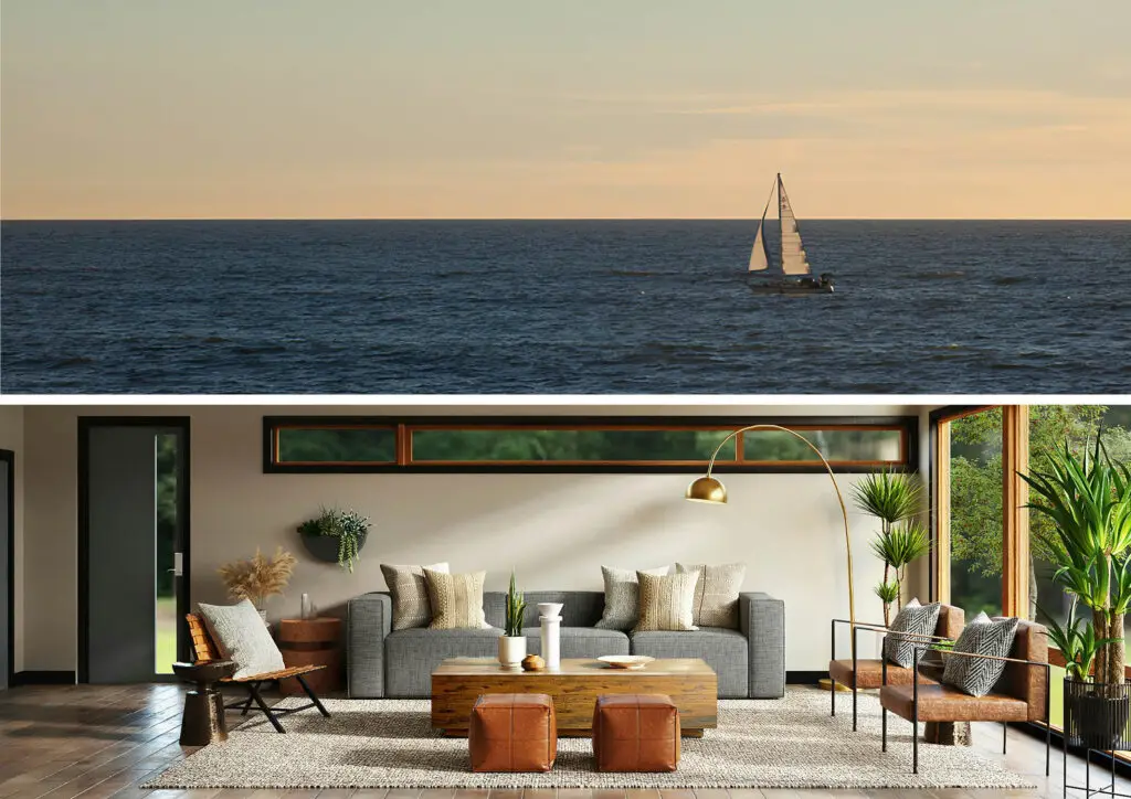
Curved lines are most similar to what the brain associates with nature; everything from rocks and leaves to entire landmasses. Curved lines feel fluid and soft; tapping into the concepts of biophilic design, which is proven to reduce stress and increase happiness.
Curved lines add a softness and elegance to a space, being used in everything from furniture to artwork, and even architectural elements. In art, curved lines evoke feelings of sensuality, playfulness, and movement. A well-designed space can also achieve these feelings.
Shape
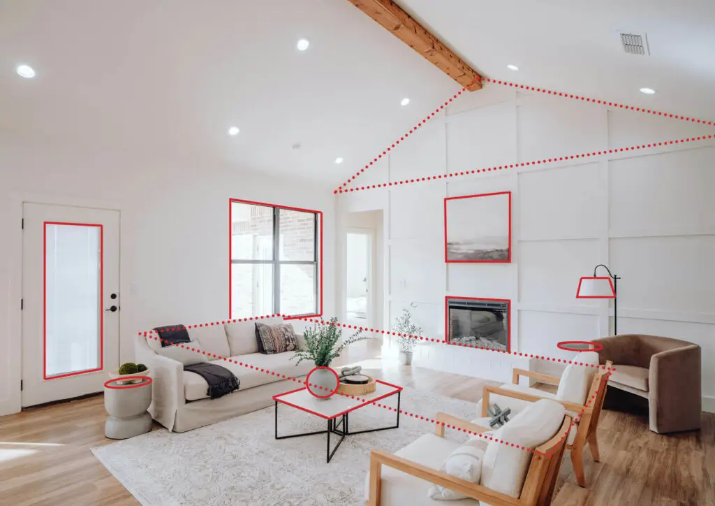
Image sourced from Unsplash/Pexels, lines added in Indesign
A shape occurs when a line is connected at both ends, often creating recognizable outlines such as circles, triangles, rectangles, and squares. While individual shapes can impact the overall look and feel of interiors, artwork, and products, the relationship of one shape to another causes different feelings to be evoked within a viewer (the principles of design).
In addition to physical shapes in interiors, the brain can also subconsciously perceive shapes from the outline of a room (square, rectangular, L-shaped, etc.), architectural elements (windows, arches, ceilings, etc.), furniture silhouettes (angular versus curved), as well as arrangements of furniture and decorative elements. The image above is an example of how the brain is subconsciously perceiving a room. The best interiors have a balance of shapes to create visual interest.
Form
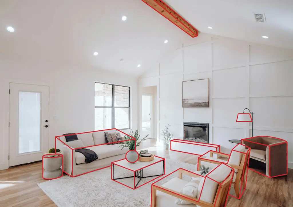
Image sourced from Unsplash/Pexels, lines added in Indesign
Often mistaken with shape, Form takes a shape (which is two-dimensional) and adds volume to it (making it three-dimensional). In artwork, form is created when shadow and light appear to interact with the object, causing the brain to perceive depth in a two-dimensional medium.
Within interiors, forms are what make up the space, occupy it, and decorate it; visual interest is created when there is an intentional interaction between them (principles of design). Geometric forms create feelings of stability and formality (due to their use of straight lines). Organic forms evoke a more playful and gentle feeling due to their connection to nature, as mentioned previously.
In the image above, the forms, as shown from the red outlines, are arranged in a way that feels balanced and uniform, causing the space to feel calm and relaxing.
Space
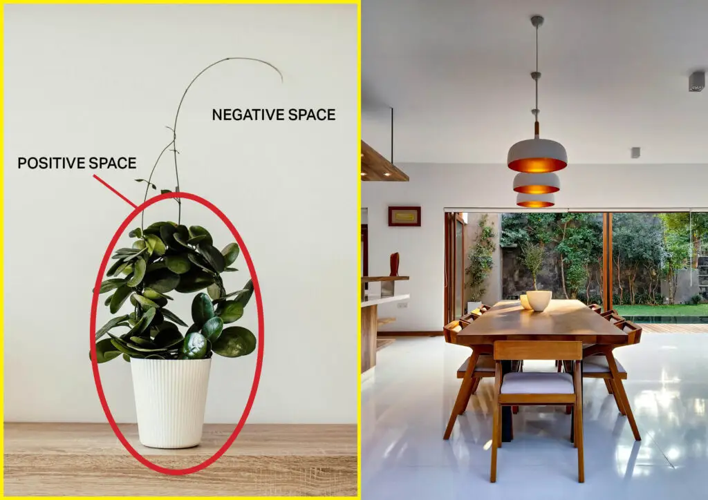
Images sourced from Unsplash/Pexels, combined in Indesign
A very important yet often overlooked concept is the relationship between positive and negative space in a design. This element subconsciously impacts the way users feel and perceive things. Positive space refers to the physical objects that make up a design or artwork; negative space is the area surrounding those objects.
Lots of negative space creates a feeling of openness, freedom, and formality. However, too much negative space can make a place feel cold and sterile. A lot of positive space (i.e., numerous objects) can create feelings of intimacy and coziness (refer to the image for the principle of variety); however, it can quickly become cluttered or have too much going on. Designers need to be intentional with the use of positive and negative space in a design since it’s vital for creating visual intrigue and mystery, especially when users are physically interacting with and navigating through a space.
Texture
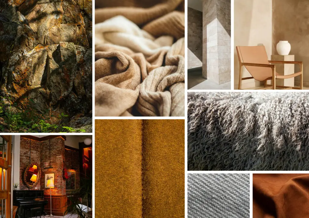
Images sourced from Unsplash/Pexels, combined in Indesign
If everything in a design had to be the same color, one way to add back visual interest is to have a variety of textures. Different shapes, sizes, finishes, and placements of these elements would draw the eye around the design.
While tactile texture allows added stimulation through touch, designs don’t always require the users to feel every material in a space. Visual textures provide an illusion of depth in a way that something appears to feel some way if the user were to touch it, but would find that it’s flat. This gives some freedom for how expensive a design has to be without taking away from the intended effect on the user.
Pattern
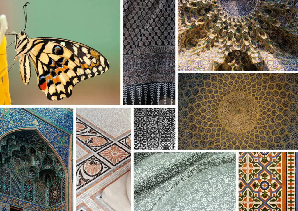
Images sourced from Unsplash/Pexels, combined in Indesign
A pattern is the predictable repetition of motifs (a decorative design) across a surface. Many motifs throughout time have been inspired by nature and have been incorporated into the built environment through materials, architectural elements, and artwork.
Within a design, the choice of patterns can amplify all the design elements previously mentioned. In general, less pattern creates a feeling of tranquility, while more pattern creates a feeling of energy. It’s best to use this design element with care. Even designs that are maximalist, using many different patterns together, are pleasing to look at because harmony is created through the combination of colors, shapes, and visual balance.
Color
Color can be the most overwhelming, yet satisfying, part of any design and plays an essential part in creating a desired atmosphere. It also plays a crucial role in product design for the perceived value and quality of the object. There are many ways to break colors into groups, with the most common being as follows:
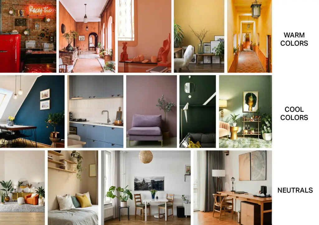
Images sourced from Unsplash/Pexels, combined in Indesign
Perceived Temperature
Warm colors (reds, oranges, and yellows) create a feeling of warmth, energy, and passion. When used correctly, they create cozy spaces, but when used in excess, they can feel overwhelming. Warm colors can feel dynamic, active, and exciting, but they also evoke feelings of warmth, approachability, and comfort, depending on the physical qualities of the colors (mentioned in the next section).
Cool colors (blues, greens, and purples) create a feeling of tranquility and calm due to blue being associated with peace and stability, green with nature and rejuvenation, and purple with luxury and creativity. However, when used in excess, cool colors can make a space feel sterile and harsh.
Neutrals (whites, greys, beiges, and browns) provide a backdrop for accent features and give the eye something to rest on within a design. Having all bright colors and busy patterns can achieve good designs when done intentionally, but giving the brain a break from constant visual stimulation prevents visual overwhelm. This increases the likelihood of the user wanting to stay in the space for longer. Neutrals create spaces that feel sophisticated and calm through their simplicity. When used unintentionally, spaces can feel sterile and dull, but when used well, with thoughtful consideration of other design elements and principles, these spaces remain timeless. Whites and grays feel elegant, while beige and browns create more warmth and earthiness.
Graphic created in Indesign
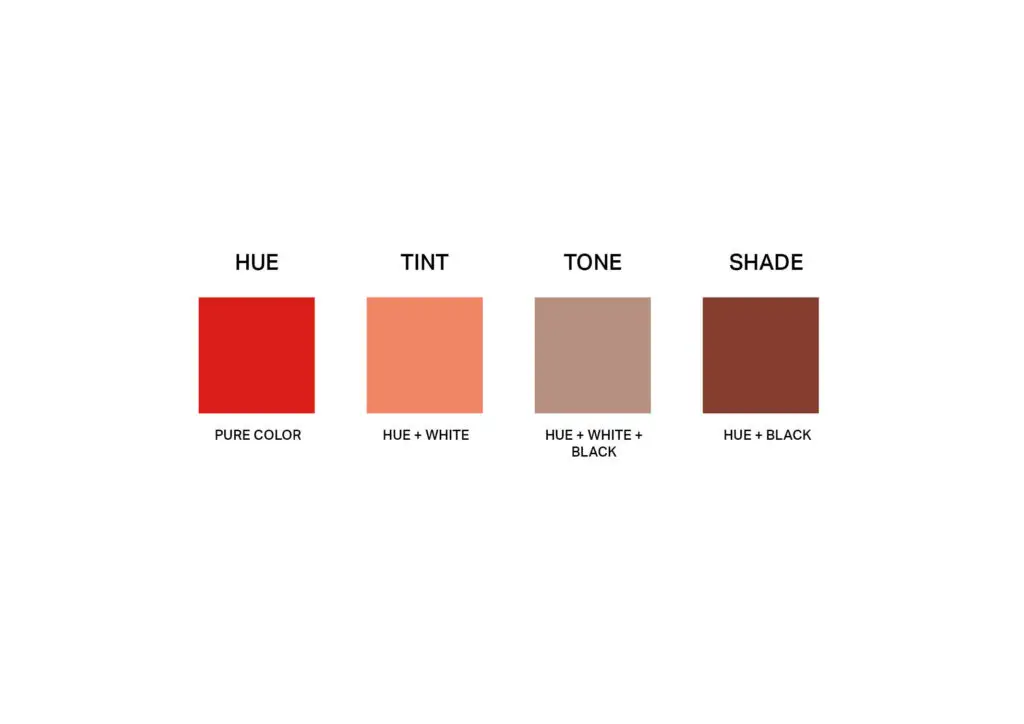
Physical Descriptors
A color’s hue is the pure color itself, most intense and unapologetic. A color’s value is the perceived “darkness” or “lightness” of the hue due to adding black (to create a shade), white (to create a tint), or gray (to create a tone) in various amounts. A color’s chroma is the intensity or saturation of the hue. A high-chroma is vibrant, while a low-chroma is muted (appearing more gray).
These descriptors are best shown using the Munsell Color System, which offers a three-dimensional model to show how hue, value, and chroma interact with each other. The hues are arranged in the outer ring, the value is each row stacked on top of each other from dark to light, and the chroma is the various rings from the outer hues to the inner column. This system offers a scientific way to measure color due to the difference between each adjacent color being equal, and includes a universal notation to easily identify specific colors.
Graphic created in Indesign
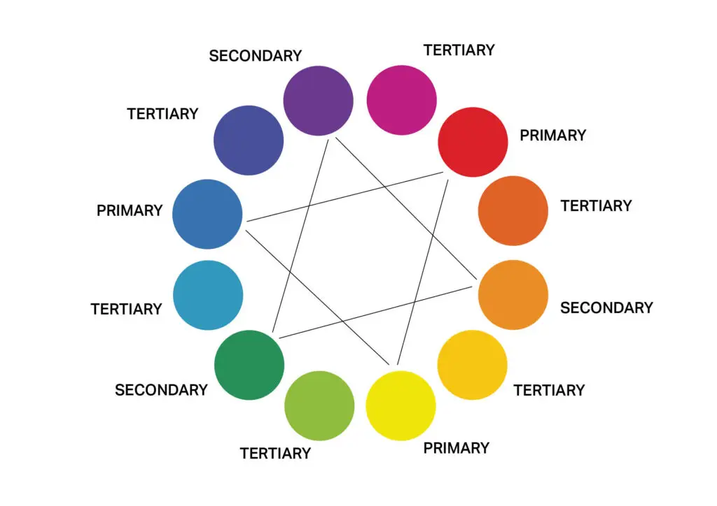
Color Schemes
Color schemes are various groupings of hues combined based on their arrangement on a color wheel. A color wheel (shown above) starts with the three primary colors: red, blue, and yellow (hues that cannot be created from other colors). These colors are mixed together to create secondary and tertiary colors that total to 12 colors on the wheel.
Primaries mix to create secondaries (purple, orange, and green), and a secondary plus a primary mix to create a tertiary (yellow-orange, red-purple, etc.). The color schemes created from these 12 colors are made from the relationships of proximity to each other and are visually pleasing to the eye, creating a feeling of harmony (one of the principles of design).
Images sourced from Unsplash/Pexels, combined in Indesign
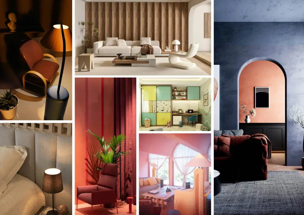
- Monochrome schemes use the same color with variations of tints, shades, and tones. For example, the red room in the image above. Care needs to be taken to avoid a feeling of monotony, but when done right, this color scheme creates a feeling of sophistication, unity, and calmness.
- Analogous color schemes contain two to three colors that are adjacent to each other on the color wheel. For example, a combination of red, red-orange, and orange. This scheme is harmonious and very easy on the eyes since they are often found in nature.
- Complementary color schemes use two colors that are directly opposite each other on the color wheel. Some examples include blue and orange, red and green, or yellow and purple. These schemes create a high impact in a space since there is an intense visual contrast. See the interior on the right side of the image above.
- Split Complementary is a variation of the previous scheme, where, instead of the opposite color, the two adjacent colors on either side of the complement are used to soften the effect, creating more harmony. For example, using blue, yellow-orange, and red-orange, which includes two colors next to blue’s complement (orange).
- Triadic color schemes use three colors that are equally spaced on the color wheel, creating an equilateral triangle. This scheme is often high in contrast while still feeling balanced. For example, this scheme could consist of the primary colors: red, yellow, and blue.
- Tetradic color schemes are complex, using two complementary pairs that form a rectangle on the color wheel. This scheme can be difficult to balance, so it’s best to let one color dominate and use the others as accents. For example, this could look like a palette of red, green, blue-violet, and yellow-orange.
- Square color schemes are based on the tetradic scheme. This scheme uses four colors that are evenly spaced on the color wheel, creating a perfect square. Similar to the tetradic scheme, it can be hard to balance since it’s a very dynamic arrangement of colors. For all color schemes, the undertones of color are very important when using materials in a space; they can quickly hijack the intended effect and make the overall aesthetic feel “off.” Great care needs to be taken in how colors are grouped together.
Visual Illusions
The way color is perceived in the brain can impact how the brain interprets a space. Some examples of this include using lighter colors to make a space feel larger or using a darker color accent wall to visually “move” the wall closer in rooms that feel too big. To create intimate settings, dark colors can be used on all walls in tasteful applications with effective lighting solutions and a sense of variety from other design choices. Ceiling paint is often the lightest wall color since it visually “lifts” the ceiling to make the room feel taller.
Color can also be used to visually “divide” a space by using a lot of one color on one side of the room and another color on the other side. Finally, the objects that occupy spaces can also have a visual effect on the brain. Objects that have a darker finish or material on them appear visually “heavier” than lighter finishes (refer to the balance section later on).
Color is powerful in that it can quickly change the atmosphere of a space and show intentionality within the design. Care and conscious thought put into the various colors used through various materials/finishes will be a great indicator of a good design versus a mediocre one.
Light
Images sourced from Unsplash/Pexels, combined in Indesign
Being the element that allows viewers to perceive the world physically, light is one of the most important components of a design. It not only plays a vital role in creating intended atmospheres, but it also changes the way colors are perceived in the brain.
Color (as mentioned in the previous section) is caused by light rays being absorbed by and reflected off of an object. For instance, a red object absorbs all the other colors of light and reflects red.
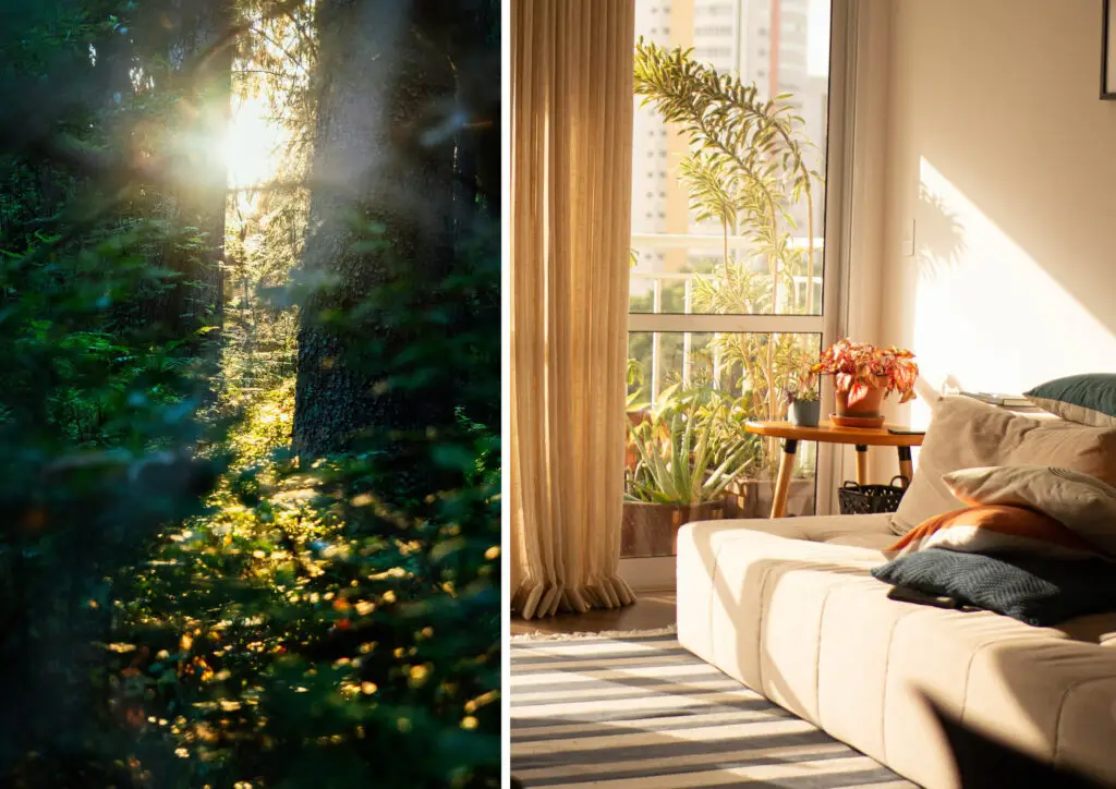
Images sourced from Unsplash/Pexels, combined in Indesign
Throughout the day, the color of daylight changes depending on the angle of the sun in the sky and how the light rays from the sun interact with the atmosphere. The warm glow of sunlight in the morning and evening is in direct contrast with the cool light of the sun at high noon. This influences how a space will look throughout the day.
Because of this, it’s important to check paint colors and fabrics at different times of the day in a space. This helps to confirm if it’s the color desired when interacting with all the colors of light coming in from the sun. Also, understanding the physical location of the space in relation to how much sunlight will be coming in can play a role in how much glare, heat gain, and sun damage the room will need to be accounted for.
Images sourced from Unsplash/Pexels and Wikimedia Commons, combined in Indesign
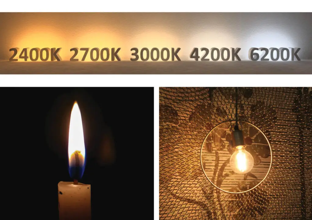
The way light is categorized is through its perceived color temperature. Color temperature (measured in kelvins) comes from a theoretical object called a “black body radiator.” Depending on the temperature of this radiator (2400k-6200k), it emits a specific color which has been matched with the corresponding color of light.
A way to explain why “cool” light is a higher kelvin temperature than “warm” light is to think about a flame. The hottest part of the flame is closest to the wick. This light is blue. The colder part of the flame is a yellow-orange. Because of this, any light above 3000K creates a very white and unpleasant light. In contrast, a light at 2700K creates a warm, cozy feeling that most people gravitate towards. Even better is if this lighting is dimmable, allowing for a softer, more intimate experience.
Images sourced from Unsplash/Pexels, combined in Indesign
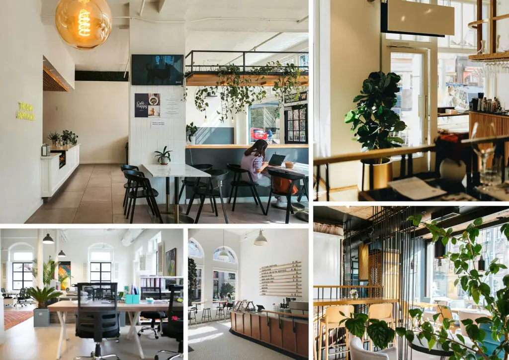
Designers can also use the changing colors of daylight to their advantage for creating healthier work environments. The circadian rhythm is directly linked to the placement of the sun in the sky, hence why there is a desire to move slowly during sunrise and sunset, and why people are very productive when the sun is high in the sky.
Certain lighting systems in offices can use sensors by windows to adjust the color temperature of lighting fixtures based on the type of light coming in from outside. This helps employees stay better in tune with their circadian rhythm, improving their sleep and overall happiness in the space.
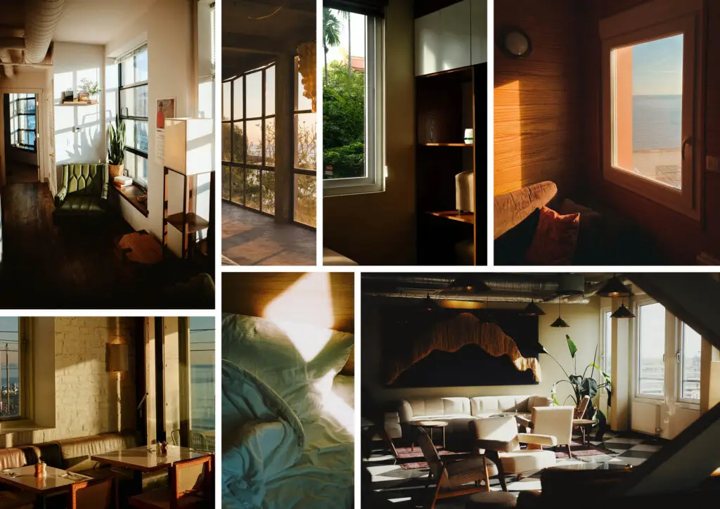
In addition to workplaces, any public spaces designed with lots of natural light feel energizing and uplifting to be in. In the images shown above, all spaces feel sleek and modern through their architectural and material selections, but the element that truly makes the designs shine is the plethora of natural light.
Images sourced from Unsplash/Pexels, combined in Indesign
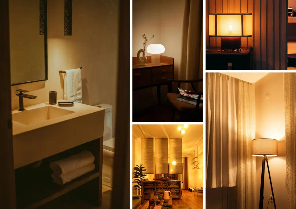
While sunlight will always make a space feel better, when the sun goes down, intentional artificial lighting can pick up the slack. Avoiding the mixture of lighting colors is vital for creating a cohesive atmosphere. As mentioned previously, 2700k is the preferred lighting temperature for most spaces (if not all in residential settings).
There are various lighting fixture types that a designer selects from to create the intended look of a space. The types of fixtures are as follows: Uplights cast light upwards, illuminating the ceiling. Downlights cast downwards, often illuminating specific surfaces such as a desk or side table. Indirect lighting casts an ambient glow and creates a warm and cozy atmosphere; this is especially true when multiple indirect light sources are used in one space. Task lighting is often right above a surface that requires a specific task to be completed, such as under-cabinet lighting above a kitchen counter.
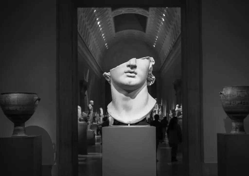
Image sourced from Unsplash/Pexels
High drama and visual intrigue can also be created with lighting, such as using spotlights to highlight sculptures, artwork, or other focal points within a design. These moments of intense lighting spots can be used to create a visual rhythm within the space (principle of design). It also creates emphasis, contrast, and harmony.
To reiterate from the previous paragraph, the most important element of lighting within a design is to use lighting fixtures with the same color temperature so all the lights feel cohesive. A mediocre design with good lighting is more pleasing to look at than a beautiful design with bad lighting. This often-overlooked element can quickly transform any space by simply replacing a light bulb.
The elements of design mentioned above can be considered a designer’s toolbox from which they pull when creating designs. The real magic happens when these elements are put together in the special relationships that follow:
Principles (How The Building Blocks Interact):
Scale & Proportion:
Images sourced from Unsplash/Pexels, combined in Indesign
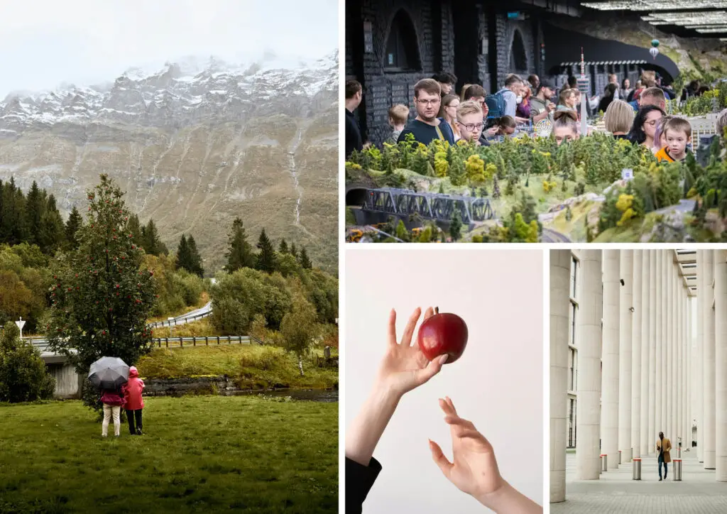
Scale is the perceived size of one object relative to another, especially when compared to a known constant. Most often, this known constant is the human body or the built environment. For instance, if an apple were the size of someone’s head in a piece of art, it’s clear that the scale has been messed with. The human brain knows that this is not based in reality.
Scale is used in design to establish hierarchy and emphasis, evoke an emotional response, create visual interest and contrast, create a sense of distortion or visual tranquility (depending on the desired outcome), and even impact the functionality of an object (when designing something that is used by the human body).

Images sourced from Unsplash/Pexels, combined in Indesign
While scale is the relationship of objects to a known constant, proportion is how elements within an object relate to each other. In other words, it’s the relationship of one element to the whole design. A great example of this is the human face. Humans are very good at sensing when something is in a different proportion compared to the rest of the components.
The proportions (size and location) of each facial feature help to create what the brain recognizes as the whole. Visual harmony (mentioned later) requires proportions that are satisfying to the human brain.
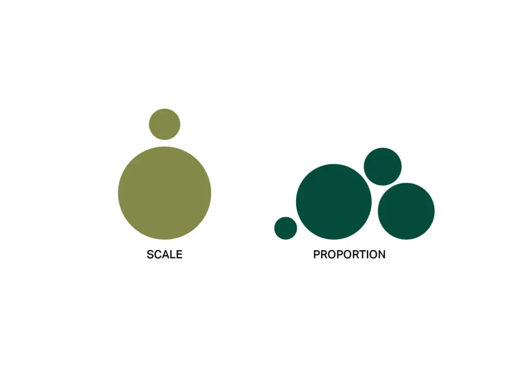
Graphic created in Indesign
Within graphic design, scale uses elements of the same appearance to establish relative perceived sizes. In the graphic above, the two light green circles appear identical except for their size. Because one was placed next to another, the circle on the bottom appears much larger than the one on the top. This also taps into the Gestalt principle of perception through proximity.
Proportion within graphic design, similarly to scale, uses elements of the same appearance to create the feeling of different proportions. For example, in the graphic above, the four dark green circles appear to be various sizes for the same reason as scale, but because there are more of them placed together, each circle feels like a part of a whole design.
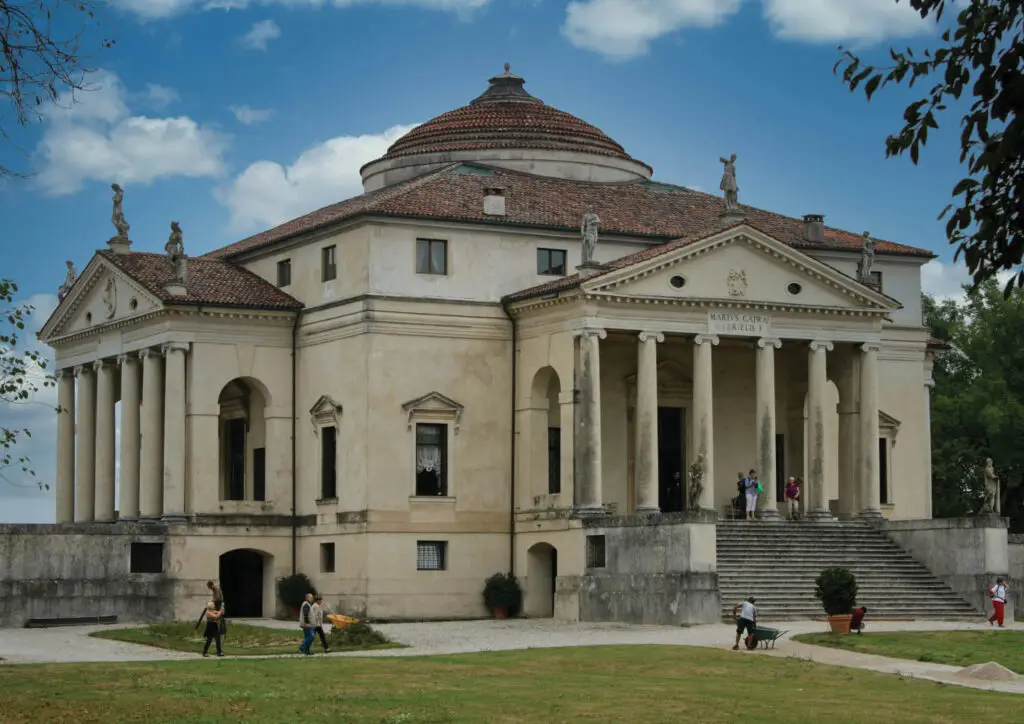
Image sourced from Unsplash/Pexels
Designers throughout history have been inspired by proportion and used it at the forefront of many designs. An architect who was heavily influenced by proportion was Andrea Palladio (the creator of Palladian Architecture). By studying the ruins and writings of Vitruvius (Roman Architect), he developed his own style, which is identifiable by a sense of harmony, symmetry, and strict mathematical proportion.
Despite designing buildings only in Italy, the influence of his design style spread across Europe and North America for centuries, supported by his publication of “The Four Books of Architecture” in 1570.
Some identifiable qualities of his architectural style include buildings being perfectly symmetrical, where one side mirrors the other, using classical elements such as columns, pediments, and entablatures, and Palladian windows (also known as Venetian or Serlian windows). Palladian architecture creates an immediate sense of order, calm, and elegance within a space, which is why it has remained so influential for centuries.
Emphasis & Focal Point
Images sourced from Unsplash/Pexels, combined in Indesign
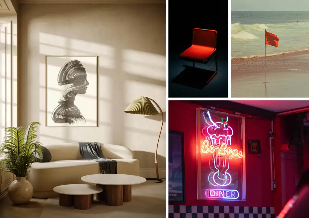
Emphasis creates visual dominance within a design, giving importance to one or more elements and guiding the viewer’s eye. It helps the brain quickly discern what’s important to look at and adds more visual interest by avoiding the monotonous feeling of everything having the same size, shape, and colors.
Additionally, the viewer’s effort of moving their eyes around the design makes it feel more dynamic and encourages the viewer to become invested through visual exploration.
The focal point is the element that’s being highlighted through emphasis, causing the brain to perceive it as important. It not only helps to add meaning and direction to a piece, but it also gives the eye a chance to naturally rest somewhere within the design. There can be multiple focal points when done tastefully, but less is more, since too many defeats the purpose of a focal point in the first place.
For the interior in the image above, the painting on the back wall is the focal point of the room due to its location and size. The eye is then drawn to the plant on the left due to the significant contrast in color in an otherwise monochrome color scheme. Finally, the eye goes to the lamp in the other corner due to its height and unique shape.
Emphasis is achieved by creating contrast between a focal point and its surroundings through the use of color, size, shape, texture, placement, light, complexity, isolation, orientation, and repetition. For example, the flag in the sand is isolated and a vastly different color from its surroundings. The Neon sign contains bright colors and lights in an otherwise dimly lit space.
Balance
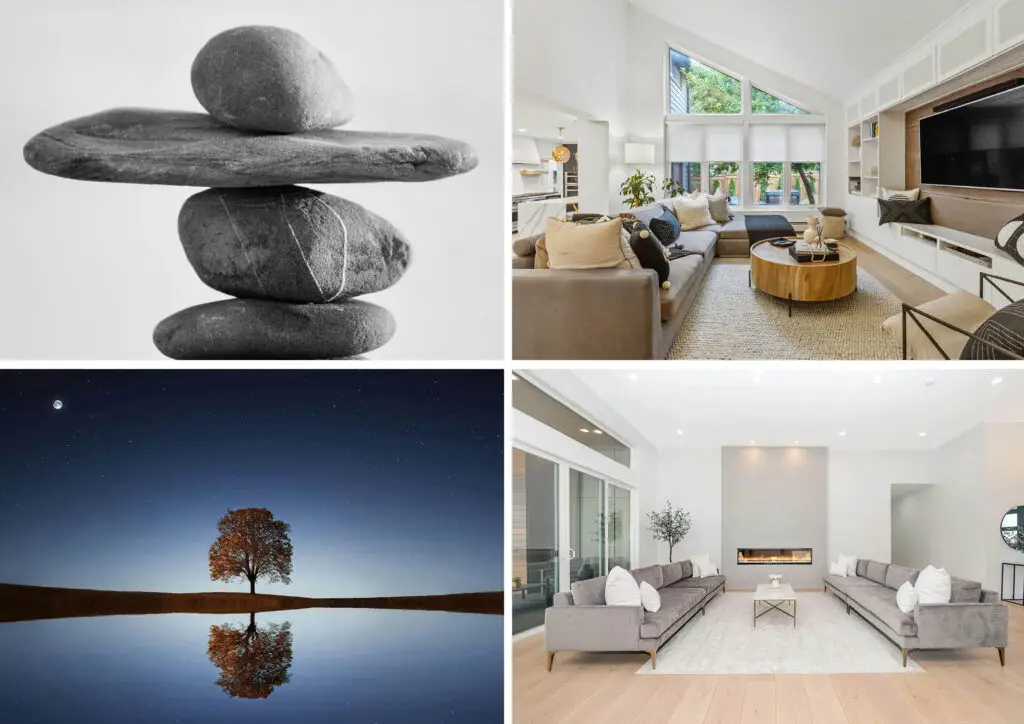
Images sourced from Unsplash/Pexels, combined in Indesign
Balance relates to the intrinsic human desire for stability and equilibrium. Unbalanced designs are unsettling or even chaotic to the viewer; however, this can sometimes be the intended outcome. Therefore, designers have to be intentional with balance to evoke the intended desire from the viewer.
Balance is achieved through careful consideration of the visual weight of design components. Visual weight is influenced by multiple factors:
- Size – larger objects are perceived as heavier
- Shape – complex shapes require more brain power to process, therefore appearing heavier than simple shapes
- Color – darker and more saturated colors hold more visual weight than lighter or muted ones
- Texture – objects with lots of texture feel heavier than smoother ones
- Position – the placement of the object within a composition can affect its visual weight
- Negative Space – The amount of negative space around an object can impact how heavy the brain perceives it is.
For the brain to associate a design of any kind with balance, the following compositions can be used:
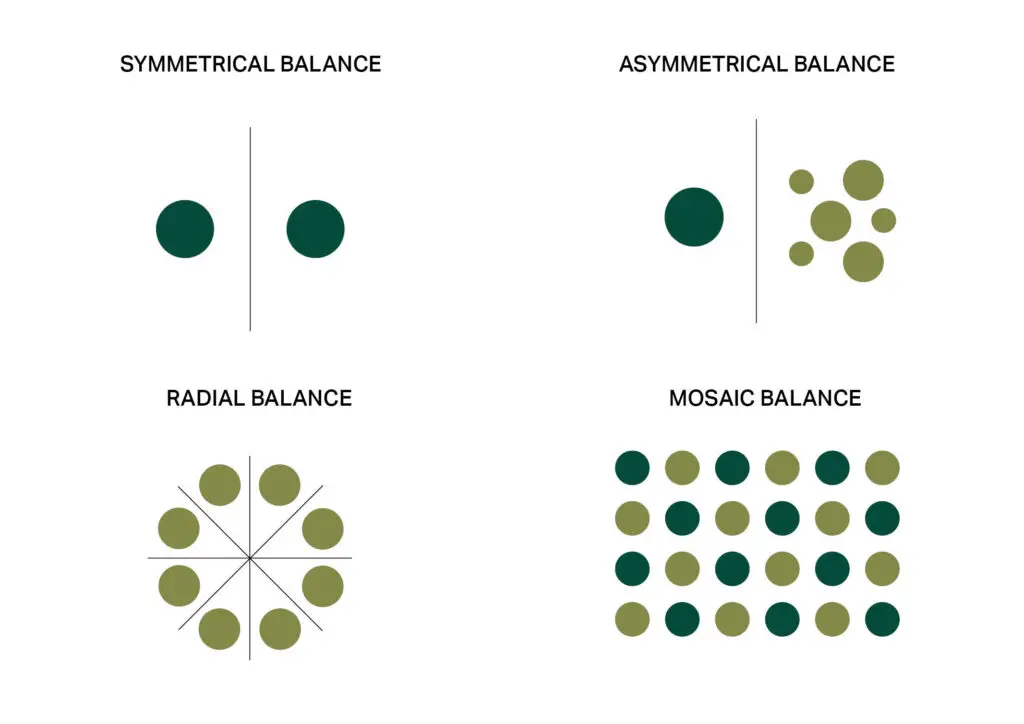
Graphic created in Indesign
- Symmetrical Balance (formal balance): Uses a central axis on which elements are mirrored. This axis can be vertical, horizontal, or diagonal. This is the most basic form of balance and evokes feelings of order, stability, and formality.
- Asymmetrical Balance (informal balance): Uses the visual weights of objects to create a sense of equilibrium. For instance, having one visually “heavier” object opposite multiple “lighter” ones. While slightly harder to achieve than symmetrical balance, this style creates more visual intrigue and feels more dynamic.
- Radial Balance: All the elements of a design radiate outwards from a central origin point. This style creates the feeling of focus and unity, drawing the viewer’s eye to the center of the arrangement.
- Mosaic Balance (Crystallographic Balance): Covers a large area, using elements with equal visual weight, to create a pattern. This style lacks a clear focal point, but feels unified through repetition of similar elements.
The human brain is very good at sensing balance and if something feels visually “off.” Therefore, designers need to be careful when designing so that they create something pleasing to the viewer. If the designer wishes to create a space that feels off, they can purposely create a space that’s not quite balanced.
Rhythm
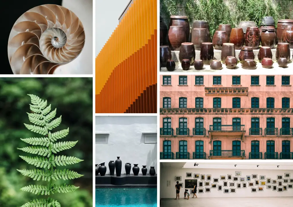
Images sourced from Unsplash/Pexels, combined in Indesign
Rhythm creates a sense of movement through the arrangement of elements. Similar to music, rhythm is a pattern that creates a visual beat and progression, drawing the viewer through the design. This principle is all about purposeful repetition or alteration of elements in a way that adds interest, creates movement, and establishes visual harmony.
Rhythm can be seen in nature through the repetition of forms, as seen in the fern and the shell above. When used in design, architectural elements and even the arrangement of objects in a space cause the eye to be drawn throughout the design.
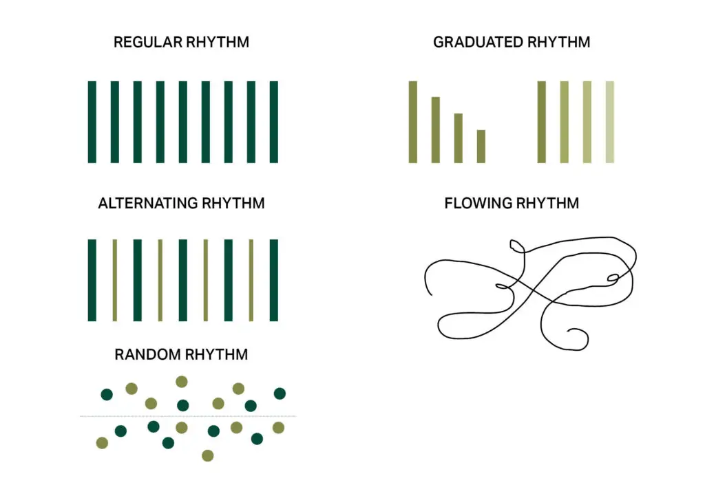
Graphic created in Indesign
There are multiple types of rhythm within design:
- Regular Rhythm: Repeating the same element with the same spacing. The predictability of this style creates a pleasing and calming effect
- Graduated Rhythm: Repeating the same style of element while gradually adjusting some quality, such as size or color. This naturally creates a feeling of progression and forward movement.
- Alternating Rhythm: Similar to regular rhythm but uses two or more elements instead of one. Using multiple elements creates more visual interest and movement due to the brain needing to process more information
- Flowing Rhythm: Uses curved and organic lines to create smooth and continuous movement. This style of rhythm evokes a feeling of peacefulness and tranquility due to the brain’s association of curved and organic forms of nature
- Random Rhythm: Uses the irregular placement of different elements while still using an underlying sense of connection between them. This allows the placement to feel like rhythm and not chaos.
Rhythm is the quickest way to add movement to a design. Whether it’s through objects found within an interior design or elements found within a graphic design, how design elements are repeated is a very intentional practice, even though it is often subconsciously perceived by the viewer.
Harmony & Unity
Images sourced from Unsplash/Pexels, combined in Indesign
Harmony, simply put, is how well different design elements work together and complement each other. When a design achieves a sense of harmony, it just feels right; everything belongs together. Harmonious designs create a sense of order and peace because the eye has a natural place to follow, and everything makes sense.
Harmony can be created through the repetition of elements, such as colors, shapes, and textures. These repeated elements create a feeling of similarity within the design, even if the elements are not identical. While using similar elements is a big part of harmony, including a little bit of variety in the design adds more visual interest.
Unity is the sense of wholeness, cohesion, and completeness. The sense that the design and all its individual parts have come together to form a whole. This principle differs from harmony in that it’s not just about elements getting along, but the singular whole they create.
Unity creates a sense of “oneness,” giving purpose for the design, preventing fragmentation (which can make a design feel messy), and ensuring clarity and comprehension of the design. It relies on proximity (which is also a principle of Gestalt), hierarchy, alignment, and continuity (drawing the eye around the design).
Variety
Images sourced from Unsplash/Pexels, combined in Indesign
To prevent monotony and boredom within designs, variety offers differences and contrasts that stimulate visual interest and excitement. It helps to create emphasis and focal points (as mentioned previously), enhances complexity/depth, and supports the overall mood or atmosphere of the design.
For instance, low variety creates a unified, calming atmosphere, while high variety creates more energy. Variety can be achieved through subtle changes or drastic ones, depending on the needs of the design. A Good Design uses harmony, unity, and variety in a way that has enough difference to be interesting, elements that work well together, and an overall feeling of “oneness.”
The principles are what bring movement and life to designs. They can be applied to anything from a single object to an entire building. The size of the design is irrelevant since every design is made up of elements that are interacting with each other, even the simplest ones.
To be a good designer, understanding and utilizing the concepts above is a vital step. A Good Design requires an understanding of what building blocks and relationships successful designs of the past used. The love for design is seen through the intentional use of the elements and principles that make it up, no matter how subtle they are.
To succeed with design is to create something that allows the beauty and simplicity of these concepts to feel natural, as if the design always existed and was waiting to be discovered.
Sources:
- Clemons, Stephanie A. Interiors: Design, Process, and Practice. 2nd ed., revised, Goodheart-Willcox, 2019
- “Design Fundamentals: Elements and Principles,” Berkeley Library, University of California, https://guides.lib.berkeley.edu/design, accessed 20 Sept. 2025.
- Gemini, Google, 23 Sept. 2025, https://gemini.google.com.